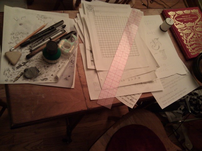
This is the desk where I did my drawing. You can see the sheaf of scratch paper on which I did initial sketches, and made records of the various symbols and alphabets that appear throughout the book. (The top paper with the gridlines proved to be less useful, as the sketchbook pages were just a little too opaque to see through.) I had several different kinds of ballpoint pens, rollerball pens, and a dip pen, which helped to make each section look a little different. The needle and white thread on the right was used to redo the binding. I took out the binding staples at the start to make it easier to work on each page individually. At the end, I rebound everything back together with thread. (I first tried to replace the original staples, actually, but I found it quite impossible to get those bent, stumpy legs back through all of the page holes. Sewing turned out to be both classier-looking and a lot less effort.)
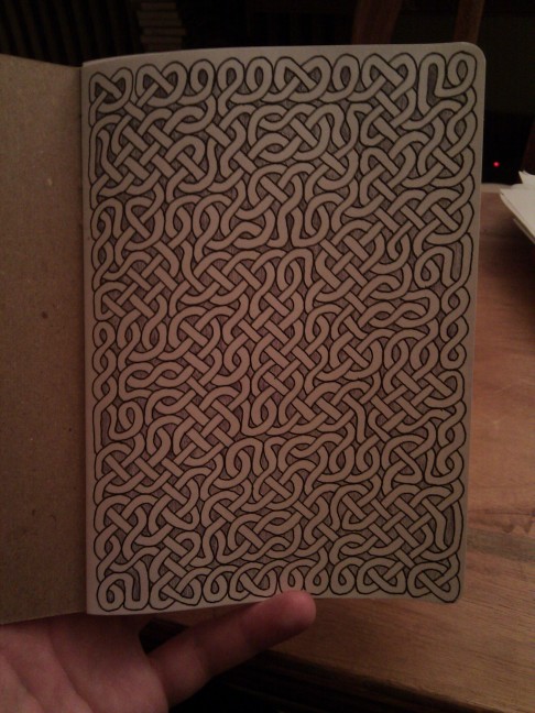
The first page of the sketchbook functions as the book's front cover. I never came up with a title that I liked, so I decided to use an abstract design on the cover. (I briefly considered putting a "title" on the cover by just drawing a sequence of symbols that didn't appear anywhere else in the book. But I realized that this had the potential to be very misleading to a would-be solver — i.e. not frustating in a good way.) Celtic knot patterns do a fine job of illustrating the idea of a interwoven tangle of threads. There are numerous computer programs out there that can automatically generate knot patterns. I used one that broke a couple of the traditional rules for Celtic knots so that it would look less like it was trying to refer specifically to Insular Art. It took me over an hour just to shade in the background.
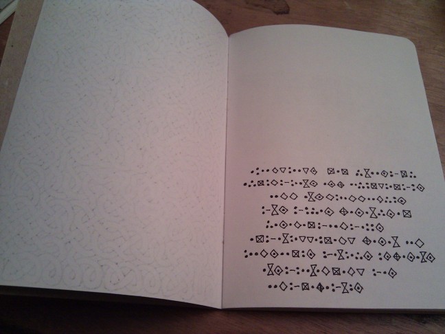
If the first page is the front cover, then the second page is the endpaper. Deciding to leave it blank allowed me to use my rollerball pens to draw the front cover without worrying about all the bleed-through. Page three contains the book's first coded message.
The photo was taken right after I finished drawing the page; as you can see, the pages are still unbound. This photo also shows what it looked like before the lettering on the other sides of the paper bled through.

I designed the initial "J" on a sheet of scrap paper, traced it onto the page in pencil (using my window as a makeshift light table), and then inked the final version. I actually tried using a French curve to ink the letter at first. I had never used a French curve before, but this whole project was something of an experiment anyway, so I figured there was no better time. It proved to be a failed experiment: the results weren't significantly better than what I could have done freehand, and at one point the French curve smeared the ink. The shading around the letter was added in order to cover up the smears. Because of this, I made a conscious decision to ink everything freehand. Even the perfectly straight lines; the ruler was used only for pencil-work. It seemed likely that having a few non-shaky straight lines in the book would just make all the other shaky lines look that much worse.
This photo contains an example use of several pen types. The left-hand page's lettering is mostly ballpoint pen, with rollerball pen for the line of lettering at top and bottom. The right-hand page uses the dip pen for the lettering. The illustrations are done with a different ballpoint pen, one with a lighter ink that permitted a wide range of shading.
The process of inking the book and coming up with the book's contents overlapped rather more than I would have liked. That was the effect of my deadline: I simply didn't have time to wait until I worked out all the details before breaking out the pen and ink. In particular, the symbols on the left-hand side (which also appear near the bottom on the right-hand side) were invented only two days before the deadline, as I realized that my current structure required one more alphabet than I currently had. Given the time crunch, I made a conscious effort to make one that was easy to letter. One of my goals was to give each alphabet a distinctive texture that would be immediately visible on the page, but not making the letters so simliar to each other as to induce confusion in the would-be reader. The central aesthetic of this particular alphabet is that each letter consists of a single curved line — no straight lines anywhere. This aesthetic made lettering a breeze, and I finished the page in record time.
Determining the layout of a solid block of text is non-trivial under regular circumstances. When I do a bit of lettering, I typically write a few lines' worth on scratch paper, and then extrapolate to determine about how many lines the full text will need. The estimate is rarely exactly right, and sometimes I have to start squeezing words into the last few lines. On a page like this one, with two very narrow columns making for lots of unpredictable line breaks, estimating the necessary space can be very error-prone. Now imagine trying to make that estimate when you're writing in an unfamiliar alphabet you've never done any lettering in before. The overall obstactles for laying out this particular page were enough that I totally cheated. How? Simple. This alphabet, unlike all the others in the book, is made up of various obscure Unicode characters, so they can all be rendered by (say) a web browser. I mocked this entire section up as a web page, and then fiddled with the layout until everything fit in the available space. Then I taped the sketchbook page to my computer monitor and traced the whole thing. Huge time-saver. The downside of this approach is that the text is a little light and shaky from writing on a vertical surface, and my being unable to press down hard for fear of damaging the monitor. (It's one of the few times in my life that I missed the heavy glass displays of those old CRT monitors.)
When I first starting lettering the book, I was surprised at how much space the sections of text took up. Back when I was sitting at my editor, a paragraph of only 250 words seemed a bit lightweight, almost lazy even. Then I discovered that a single page barely permitted space for 100 words, and soon I was back at the editor, desperately trying to squeeze the same content into fewer words. Making the lettering smaller and reducing the space between lines are two options, normally, but given that the reader is already trying to read an unfamiliar alphabet, I felt that I needed to avoid potential obstacles to legibility. In this particular case, even after strenuous editing, I got halfway down the left page when I realized I still wasn't going to be able to fit everything in the intended space. So I had to let the last part continue onto the right-hand side.
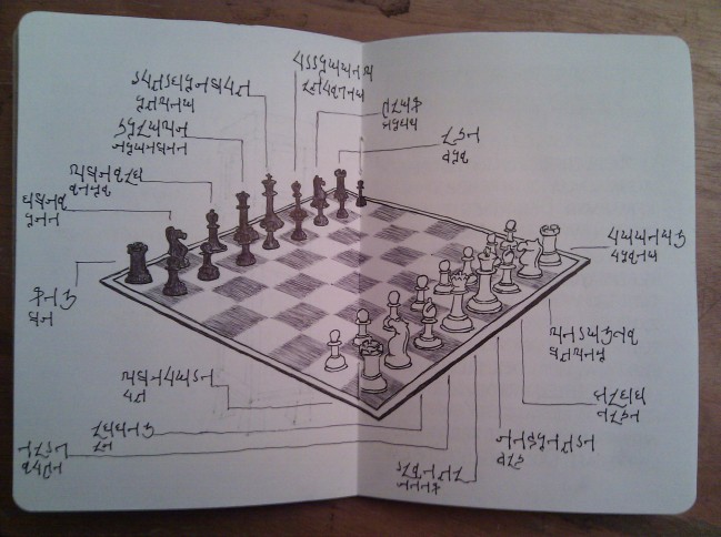
I knew early on that this diagram would never fit onto one page, so I placed it in the center where it could sprawl across both sides. Incautious planning caused me to place one of the text fragments so that it ran off the left-hand page onto the right-hand page, causing the symbols in the pages' gutter to get missed by the scanner.
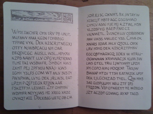
A second example of text written in the familiar Roman alphabet. Like the first, everything is done in uppercase, as is usual for enciphered texts. I don't know if it's done that way for actual reasons or just because it's traditional. (I assume it makes it somewhat easier to see certain patterns than with mixed-case lettering, but that's just hypothesizing on my part.) To draw these pages, I would generate the enciphered text using a short script (either Perl or Python, depending on various arbitrary factors), and then display the text on my computer monitor in a gigantic font that I could see comfortably from my writing desk. This process meant that I had to occasionally get up and scroll the display, but I wanted there to be no extra steps between the automatic generation of the text and its committal to the sketchbook's page. A lifetime of experience has taught me that every manual step adds another possibility for errors to creep in.

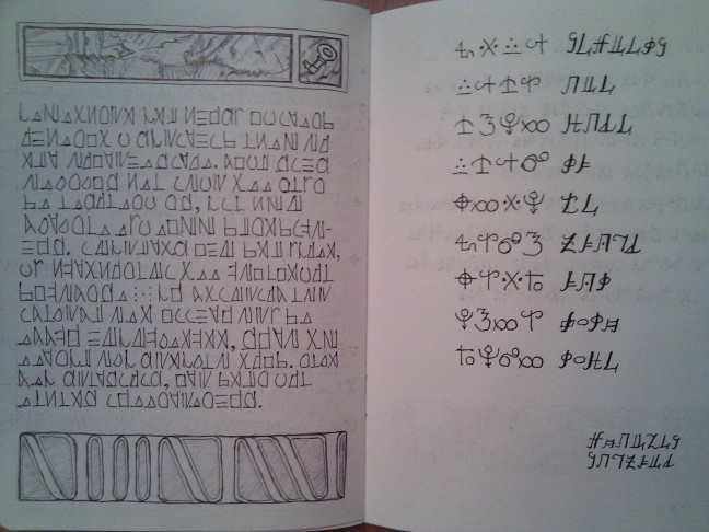
Another page where I had trouble fitting the text into the desired space. This time, instead of overflowing the text onto the illustation page, I made the lines of text smaller and squeezed them closer together. I think this page is still legible, but of course I'm not necessarily the best judge, since by the time I was ready to do the lettering for a page like this, I had become relatively familiar with the alphabet. This is one of many areas where I would have liked to have had someone that could give me critical feedback on the design beforehand. This page also has the most inept illustration in the sketchbook. The perspective is quite uneven. I may be a decent letterer, but when it comes to illustration I am strictly an amateur.

These pages are the first that I committed to paper. At the time I was nervous about making transcription errors — presumably an easy thing to when writing down near-random strings of letters, but which might easily render a page unsolveable. I was so concerned that I drew this page by first tracing the entire text from my computer monitor onto tracing paper in pencil, and then copying the text from the tracing paper to the sketchbook page by using my window as a light table. (I can't remember now why I didn't just trace from my computer monitor to the page directly, but at the time it seemed like that wouldn't work.) No doubt this drastically reduced the likelihood of an error, but it was far more trouble than it was worth. I didn't use this technique again, and I found that just being slow and careful about copying down the text was enough to produce reliable transcriptions. I also failed to plan out the page layout properly, and the symbols near the gutter on the right-hand page got cut off in the scans.
The photo for this page probably shows best the problem of ink bleeding through when using a rollerball pen (as opposed to the biro type of ballpoint pen, which uses a much drier and more viscous ink that doesn't soak into the paper). In retrospect, I should have used the dip pen in most of the places I used a rollerball. To my surprise, india ink gave me a nice solid black without soaking through to the other side at all. Chalk another one up to learning by experiment.
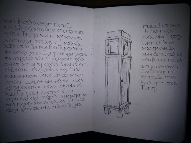
The lettering on this page was done with a rollerball pen, while the illustration was done with the drier ballpoint pen (thus the bleed-through of the former but not the latter). I was pleasantly surprised at how well the illustration came out with the ballpoint's thin lines; the photo doesn't really do it justice.
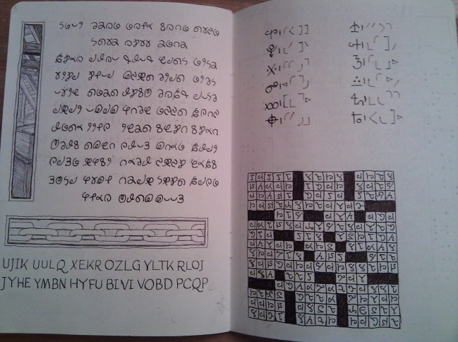
If there's any place that my decision to completely avoid using the ruler for inked lines really worked against me, it's here in the crossword grid. The shaky lines really stand out here, and not in a good way. Oh, and speaking of lines, can I just say here how much I hate having to draw pencil guide lines? They're completely necessary; my lettering invariably slopes uphill when I don't have them. But pencilling them in is a tedious process that takes longer than it seems like it has any right to. In situations like on the left side, where I needed vertical guide lines as well as the usual horizontal ones, it almost took as long as the actual lettering. And then once you're done you have to go back and erase them all, carefully and gently lest you smear the ink. (Although let me say here, why has nobody ever told me about kneaded rubber erasers before? I used one for the first time on this project, and I was amazed at how reliably it erased pencil marks without smearing ink. And no eraser crumbs. It's like magic.) I'm always trying to find ways to avoid having to draw guide lines, like having guide lines on a piece of paper underneath the page, but as I mentioned up above, the sketchbook's paper was a little too opaque to make that work.

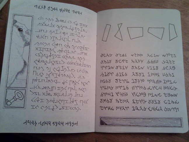
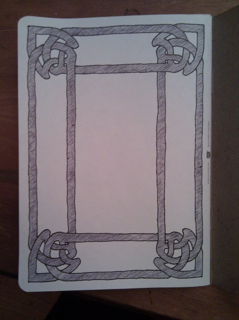
I had initially hoped to put my calligraphy skills to more use in this project, but even my smallest C-4 nib produced lines that were far too wide for anything but an oversized initial. In my original conception of this project, I planned to use decorative borders and frames on nearly every page, but the aforementioned difficulty in getting the texts to fit in the given space forced me to abandon most of that. This is one of the few places where this idea survived.
The back cover. Like the front cover, it is intended to be purely decorative. I have a book that shows examples of book cover art from the late-1800s-early-1900s. (It's the red book that can be seen in the desk photograph up top.) I paged through that to get inspiration for the sort of abstract decorations one typically sees on older books. After roughing out a design on some graph paper, I used my window/light-table to trace it onto the page in pencil four times, and then finally inked in the lines and added the shading.
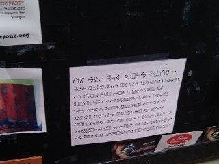
Several months after I had finished the sketchbook, I was wondering how to go about finding playtesters, since this is the sort of thing only a small group of people would find interesting. (See below if you're one of those people.) I came up with the idea of posting notices in code. Only someone who enjoys solving codes for their own sake would actually manage to read what it says, so it should be very effective at reaching the desired audience. This photo shows one of my flyers on the bulletin board of a neighborhood coffee shop.